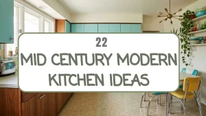
Twenty-two ideas is a lot to take in at once, so don’t feel like you need to chase all of them.
Most of these mid century modern kitchens built their look around just two or three strong choices, a cabinet color, a counter edge, one standout fixture, and let everything else stay simple.
That’s really the whole formula behind mid century modern style.
Pick the pieces that fit your own space and your budget, and save this board so you’ve got the full list to come back to when you’re ready for the next project.
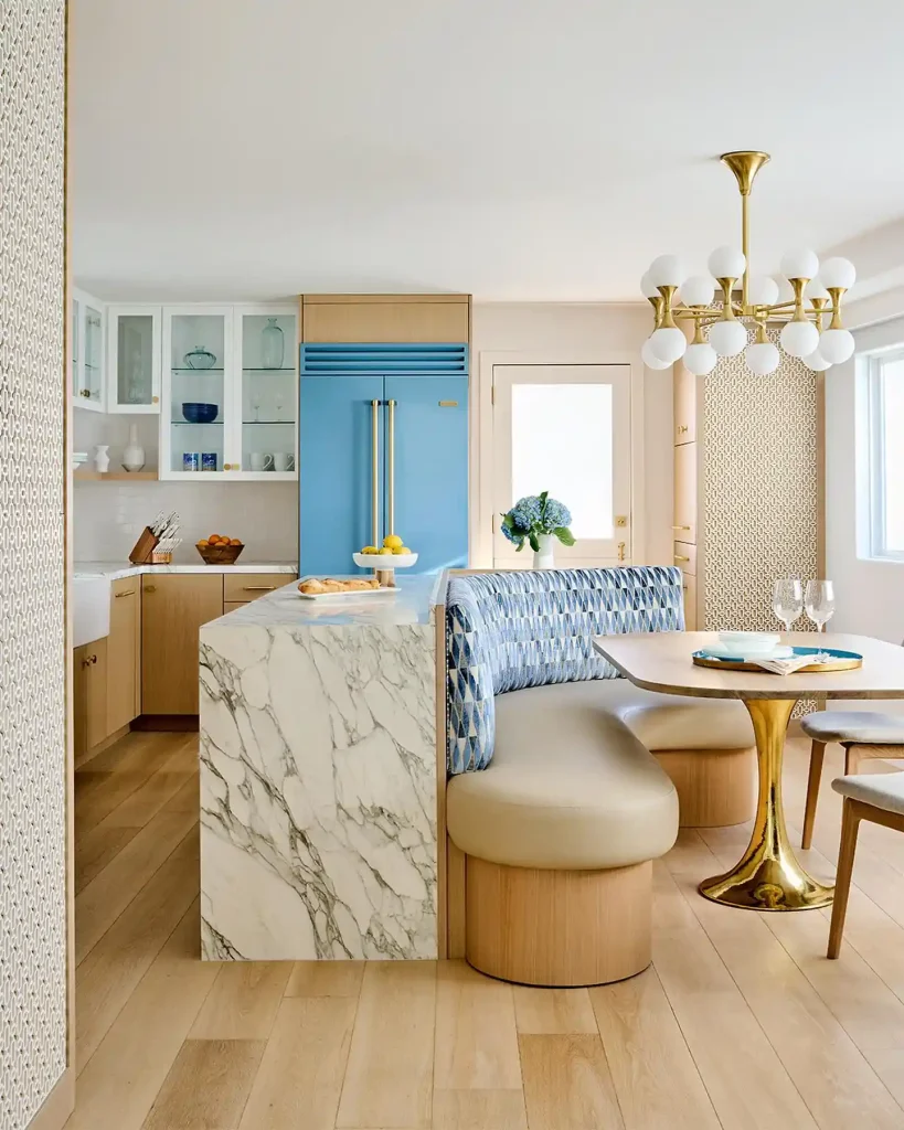
1. A Pastel Blue Fridge
Light oak cabinetry sets a calm backdrop, then a sky blue panel-ready fridge steals the show against it.
A waterfall marble island anchors the space, its veining picking up the same cool tones as the fridge. Behind it, a banquette covered in a blue diamond weave curves around a brass tulip table, while a woven caning screen softens the corner.
Worth copying:
- The one bold appliance color against mostly neutral kitchen cabinets
- Brass hardware and a brass table base tying the metals together
- A rounded banquette instead of a straight row of chairs
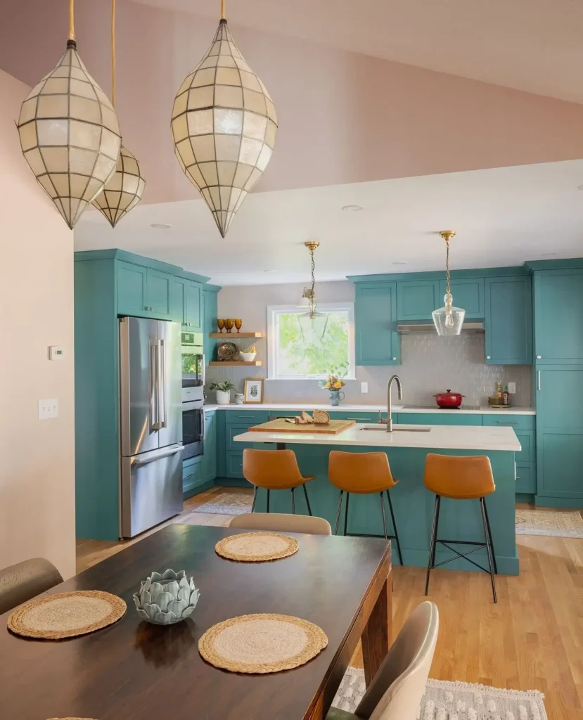
2. Deep Teal Cabinets Paired With Capiz Pendants
Teal cabinets run floor to ceiling here, giving the whole kitchen a confident, saturated backdrop instead of the usual white.
The blush pink wall just beyond the island keeps the color from feeling heavy, and a pair of capiz shell teardrop pendants add a soft, glowing texture right over the dining table.
Camel leather stools and brass pendant fixtures over the island warm things up even further.
Quick tip: if full-color cabinets feel like a leap, start with just the island in a bold shade and keep the rest neutral.
3. Walnut, Olive, and Red Make an Unexpected MCM Color Trio
Compare the two ends of this kitchen and you’ll see the trick: warm walnut wood carries the whole room, while olive green lower cabinets and red upper accents take turns being the pop of color.
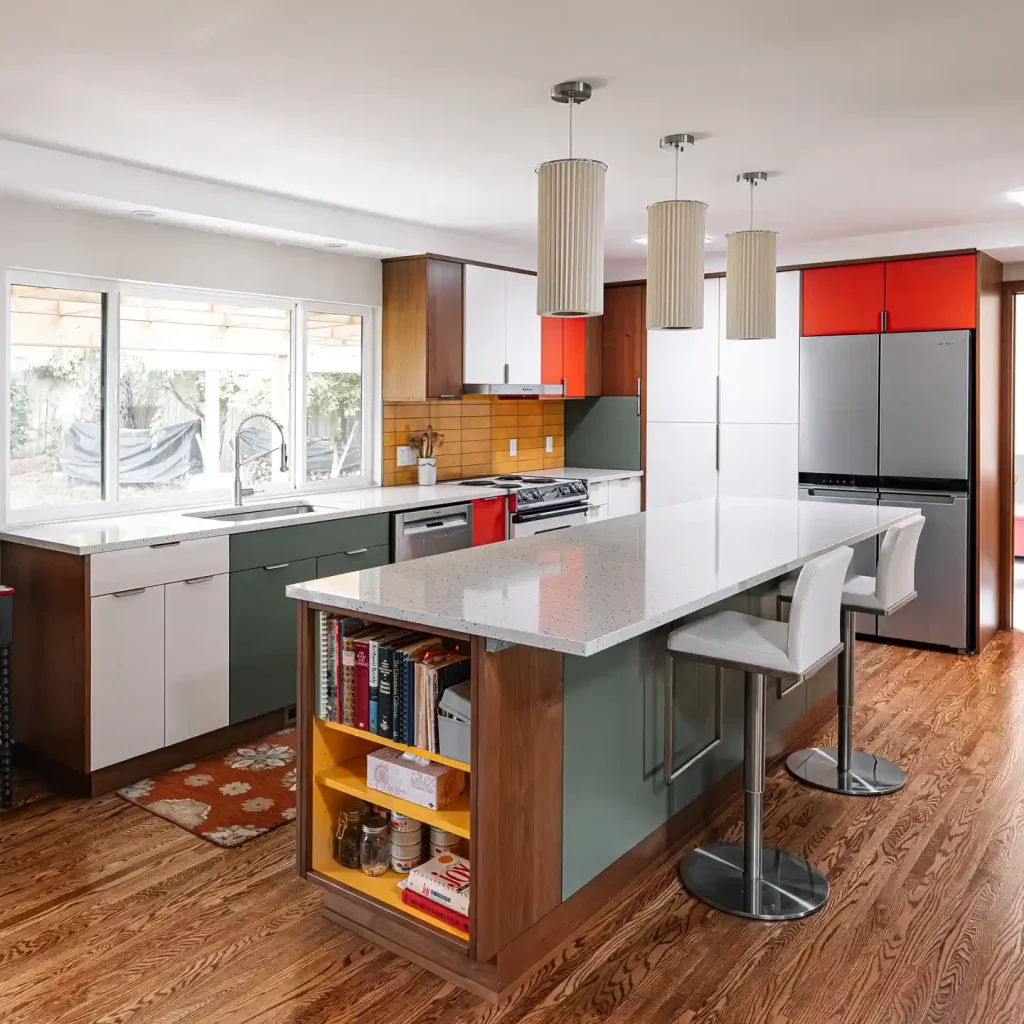
Mustard tile fills the backsplash gap between them.
The island breaks from a solid front entirely, opening into a yellow-lined bookshelf stacked with cookbooks, so even storage becomes part of the color story.
Pleated cream pendant shades keep the look from feeling too busy, giving the eye a calm spot to land.
4. Mustard Walls and Walnut Cabinets
A mustard yellow ceiling does most of the work in this kitchen, washing the whole room in warmth before you even notice the walnut and white cabinet fronts underneath.
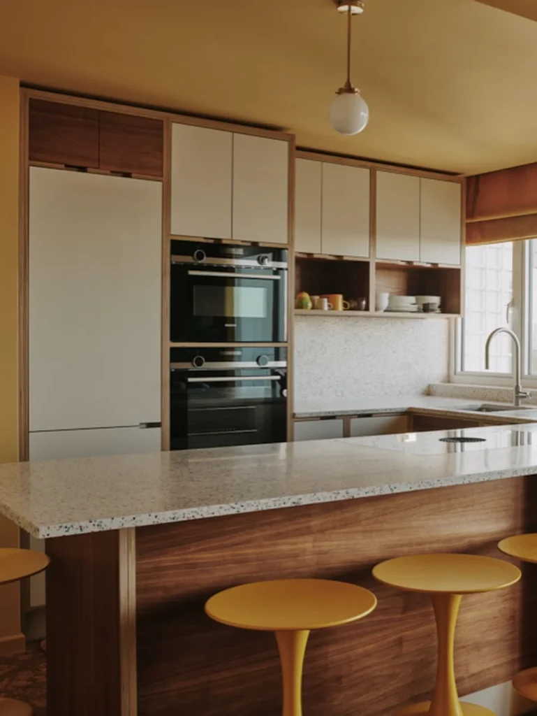
Stacked black wall ovens keep a clean, flush line next to a flat white panel fridge, and the speckled terrazzo-style counter adds just enough pattern to feel current rather than dated.
Round mustard stools with slim wood pedestals echo the ceiling color down at eye level.
Painting just the ceiling is one of the lowest-cost ways to bring mid century warmth into a kitchen that already has good wood tones.
GOOD TO KNOW
A painted ceiling in a warm tone can carry a mid century mood even when the cabinets stay neutral.
5. A Wood Tambour Pantry Door
Skip the flat panel door and let a ridged wood tambour roll sideways or up into the cabinet above it.
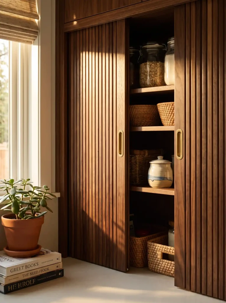
The slatted texture reads as pure mid century, especially in a walnut or teak tone, and it solves the problem of a door banging into a nearby wall or island.
Tambour fronts work well on a coffee station or appliance garage too, not just a full pantry.
- Install on a corner cabinet where a swing door would hit the counter
- Pair with brass pull hardware for a warmer finish
- Leave the inside open shelving so the curved door has somewhere to disappear
6. Hang a Starburst Clock Where Open Shelving Ends
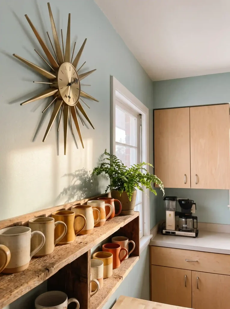
Mid century kitchens almost always have one piece that breaks from storage and just exists to look good, and a brass or walnut starburst clock is the easiest way to add that. Here’s how to place it right.
Pick a wall with open space around it, like above shelving or beside a window.
Match the clock finish to your existing hardware for a pulled together look.
Keep the rest of the wall simple so the clock stays the focal point.
7. Chrome Edge Banding
A laminate counter in a boomerang or amoeba pattern, finished with a strip of chrome edge banding, is one of the most recognizable mid century details and one of the easiest to install in an existing kitchen.
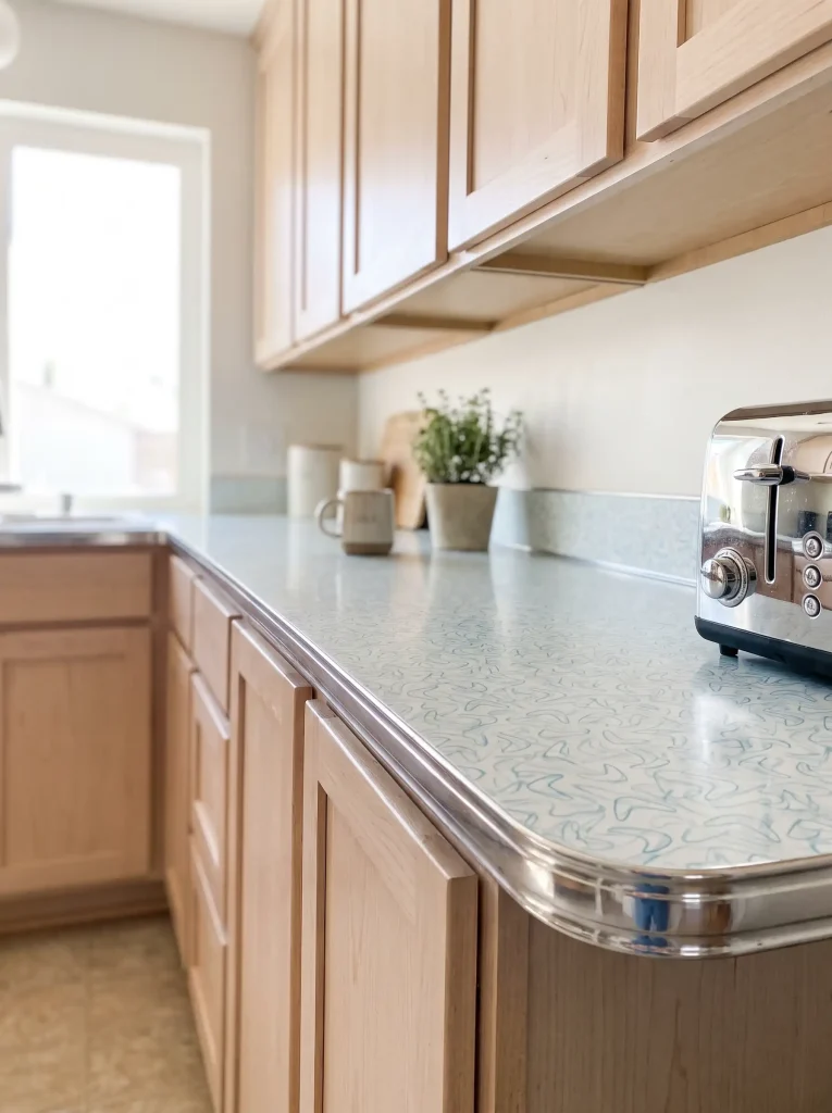
Why this works: the chrome edge catches light along the whole counter line, so even a small galley kitchen gets a bit of sparkle without adding more cabinets or appliances.
Boomerang laminate comes in soft neutrals as well as the classic speckled patterns, so it fits a muted modern kitchen just as easily as a full retro remodel.
8. Walnut Island or White Island
Both choices show up constantly in mid century kitchens, and each pulls the room in a different direction.
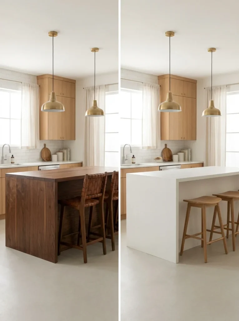
Neither is more correct. A walnut island suits a kitchen already leaning woody and warm, while white lets a punchy cabinet color stay the star.
9. A Sunken Breakfast Nook
Built-in bench seating around a low table, tucked a step below the main kitchen floor, gives mid century kitchens one of their coziest signature moves.
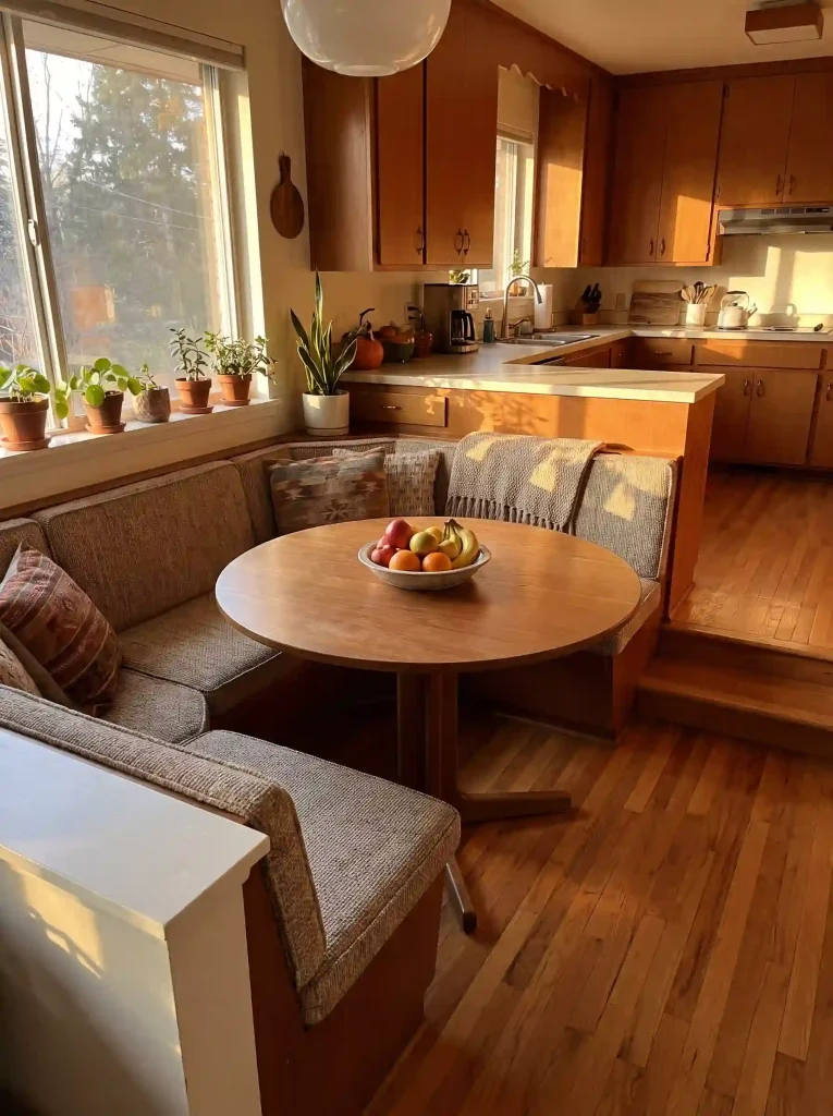
The step down is optional. A flush built-in bench with the same low profile table still gives you that gathered-in feeling without any structural work.
10. Herringbone Tile Gives a Flat Backsplash Real Depth
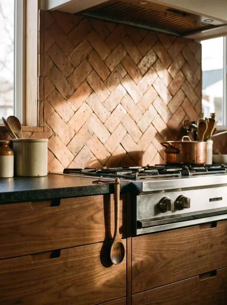
Even a single neutral tile color looks different once it’s laid in a herringbone pattern instead of a straight grid, and that shift in direction is a quiet way to bring mid century movement into a kitchen that otherwise stays simple.
- Works in ceramic, zellige, or even basic subway tile cut at an angle
- Pairs well with flat panel cabinets since the tile carries the texture
- Keep grout close to the tile color so the pattern reads clean, not busy
11. One Statement Pendant Cluster
Instead of three matching pendants in a row, group several different globe shapes and sizes together over one end of the island.
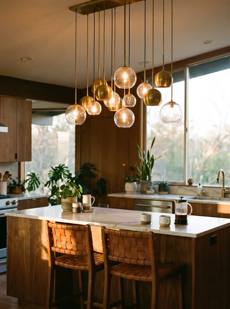
Watch out: too many different shapes without a shared finish starts to look cluttered instead of curated. Keep the metal finish consistent even as the glass shapes vary.
A cluster like this works best over an island end used for casual seating rather than food prep, since the light spreads wide instead of focusing straight down on a cutting board.
12. Two-Tone Cabinets Keep a Walnut Kitchen From Feeling Heavy
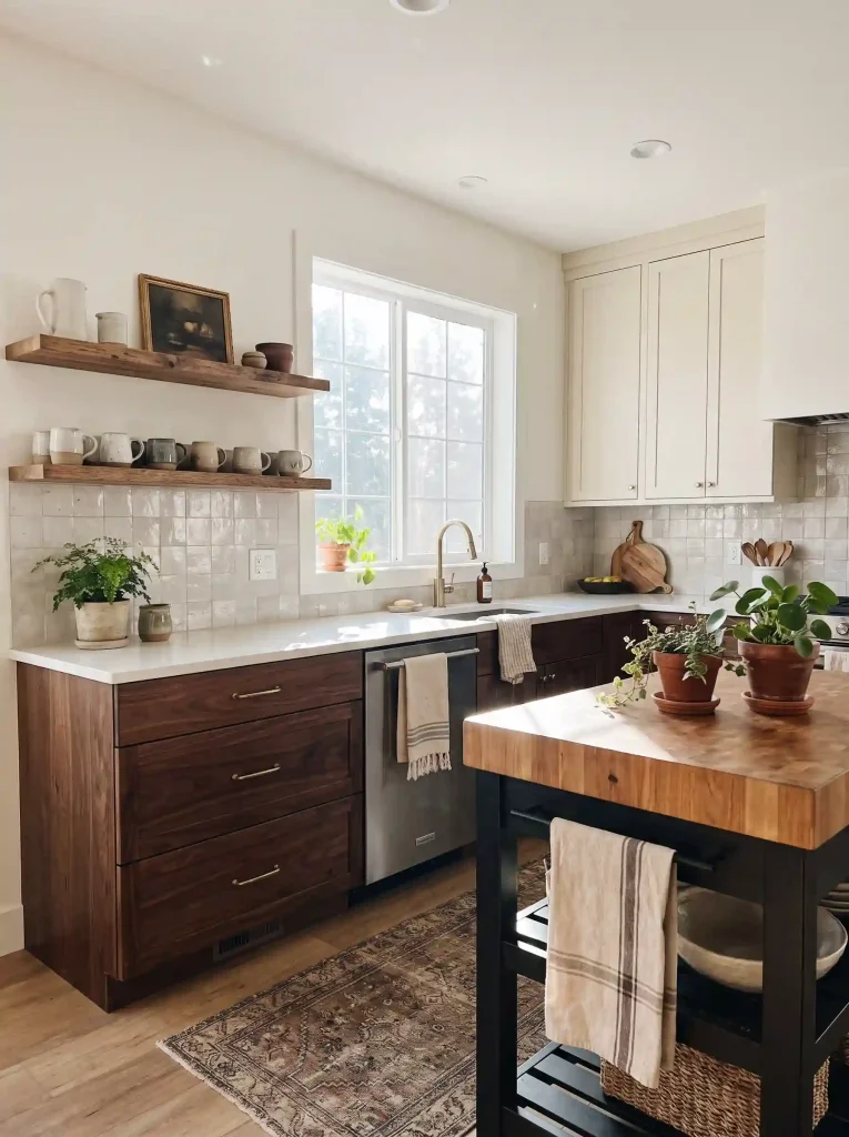
Walnut lower cabinets paired with cream or white uppers solve a common problem: a kitchen done entirely in dark wood can start to feel closed in, especially with low ceilings.
Splitting the tones keeps the warmth down low where it grounds the room, while the lighter upper cabinets bounce light back up.
- Walnut or dark oak on base cabinets and the island
- Cream, white, or pale sage on wall cabinets
- Matching hardware finish across both tones so the split feels planned
13. Checkerboard or Plain Tile Floor
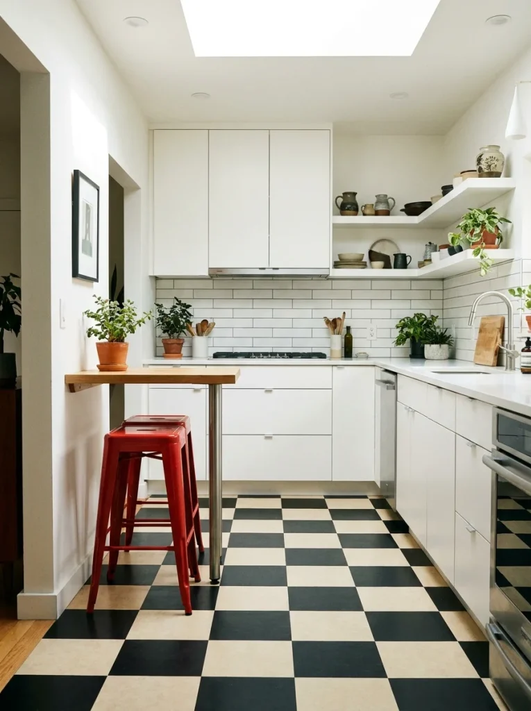
A black and cream checkerboard floor is instantly recognizable as mid century, but it isn’t the only option, and it’s worth weighing against a quieter plain tile before committing.
A checkerboard floor reads loudest in an all white or pale cabinet kitchen, where it has room to be the one bold move.
14. Swap a Few Upper Cabinets
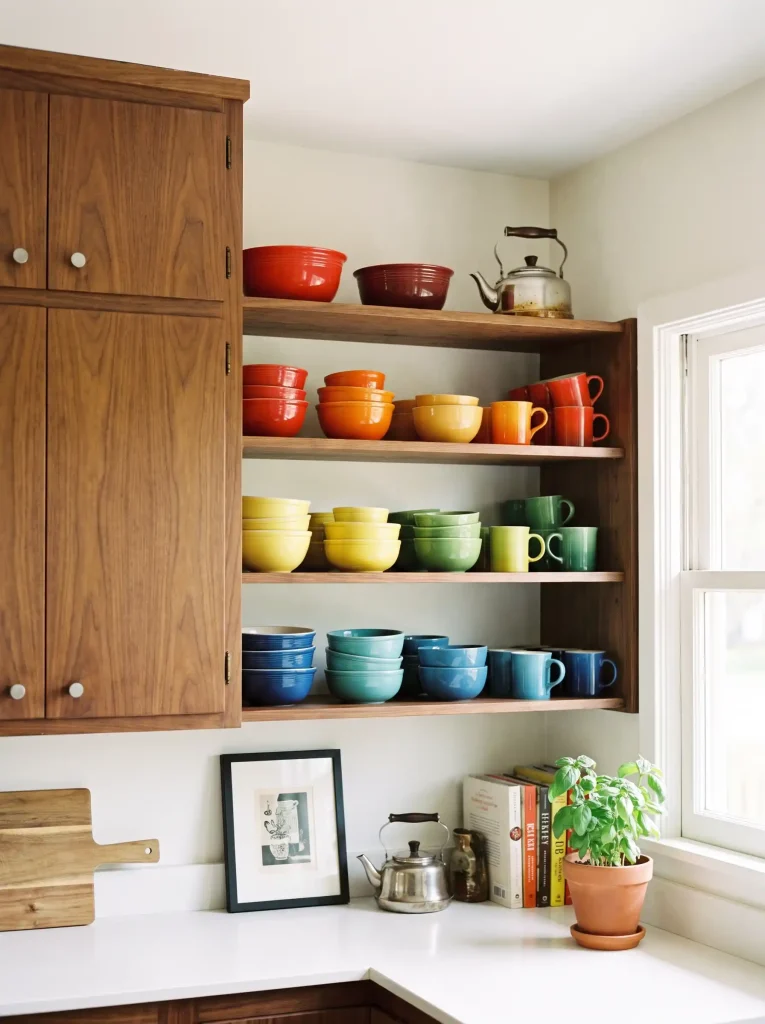
Pulling just one or two upper cabinet doors and replacing them with open wood shelving gives a kitchen somewhere to display colorful dishware instead of hiding it away.
- Keep the shelving to one wall so the kitchen doesn’t lose storage everywhere
- Group ceramics by color rather than lining them up by size
- Leave a little empty space on each shelf so it reads curated, not crowded
15. Cut an Arched Pass-Through Between the Kitchen and Dining Room
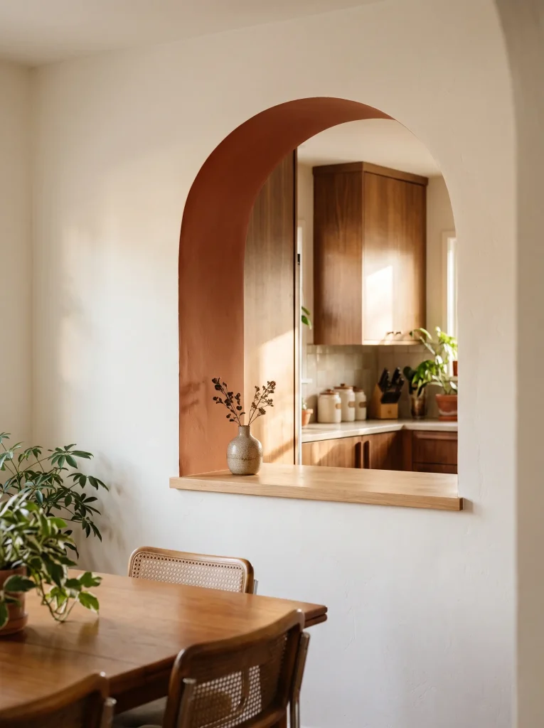
An arched opening in the wall between the kitchen and dining space keeps the two rooms connected without a full open concept layout. Here’s how it typically comes together.
- Frame the opening with a soft arch instead of a square cut, echoing the curves common in mid century design.
- Add a narrow ledge or shelf along the bottom edge for serving dishes to pass through.
- Paint or finish the inside of the arch in a contrasting tone to frame the view on both sides.
16. A Harvest Gold or Avocado Range
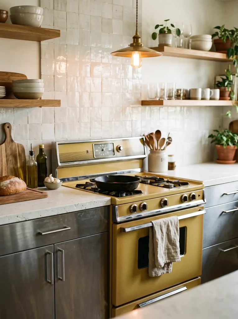
Not every appliance needs to match the era. Picking just the range in a true vintage color like harvest gold or avocado green gives a kitchen one unmistakable retro moment while the fridge and dishwasher stay modern stainless.
Several current appliance brands now make retro-style ranges in these exact tones, so you don’t need to hunt down a restored vintage unit to pull this off.
17. Finger Pulls Instead of Knobs Keep Cabinet Fronts Completely Smooth
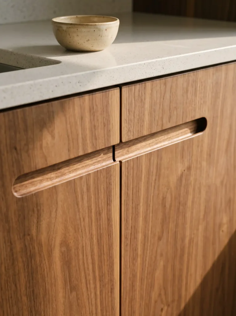
Routed finger pulls, a groove cut directly into the top edge of a cabinet door, remove the need for any visible hardware at all. The result is a flat, uninterrupted front that leans more minimalist mid century than the brass-knob version of the style.
- Works best on flat slab or simple shaker doors
- Needs no extra parts to install, just a routed groove
- Pairs naturally with wood grain fronts since nothing interrupts the pattern
18. Add a Caned Cabinet Panel
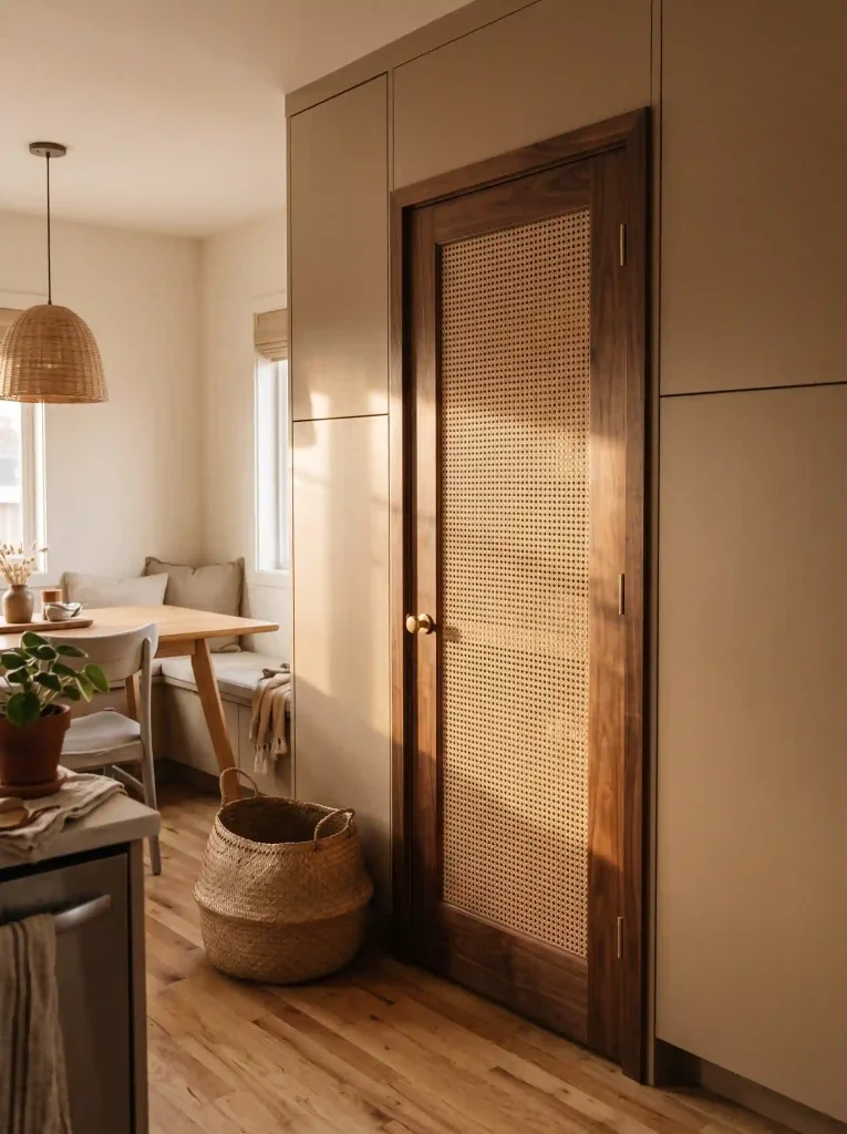
A single caned door or panel brings the woven texture people love about open shelving, minus the dusting and the need to keep everything behind it perfectly tidy. It works especially well on a pantry door or a glass-adjacent cabinet near a dining area.
One panel is often enough. Caning across an entire wall of cabinets can start to feel fragile and hard to keep clean over time.
19. Laminate or Butcher Block
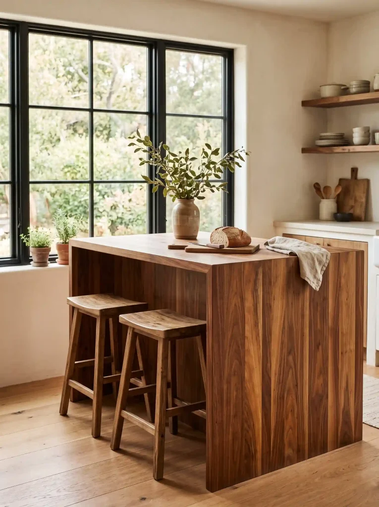
A waterfall edge, where the countertop material wraps straight down the side of an island, reads differently depending on what it’s made from.
Neither one is the wrong call. Laminate suits a bold color kitchen that wants a flat graphic edge, while butcher block fits a warmer, wood-forward room.
20. A Jalousie Style Window Over the Sink
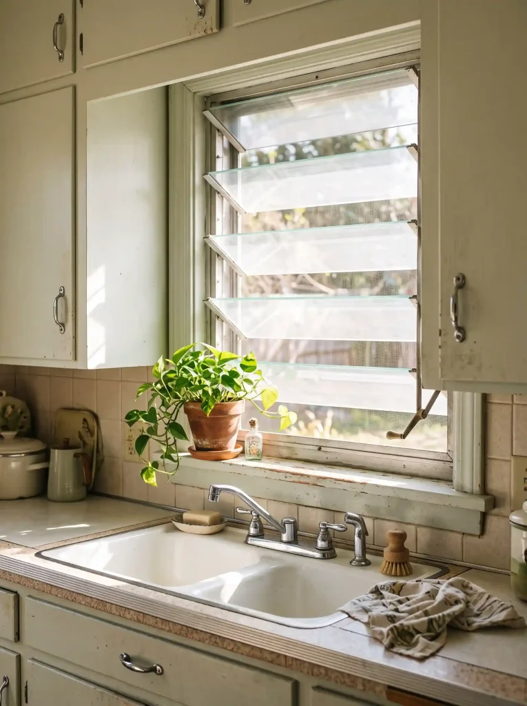
Louvered jalousie windows, with their stacked horizontal glass slats that crank open, were common in mid century homes and give a sink area a distinct look you won’t get from a standard double hung window.
If a full jalousie window isn’t practical, even a single crank-out casement window with a simple grid pattern nods to the same era.
21. Keep a Statement Backsplash Simple
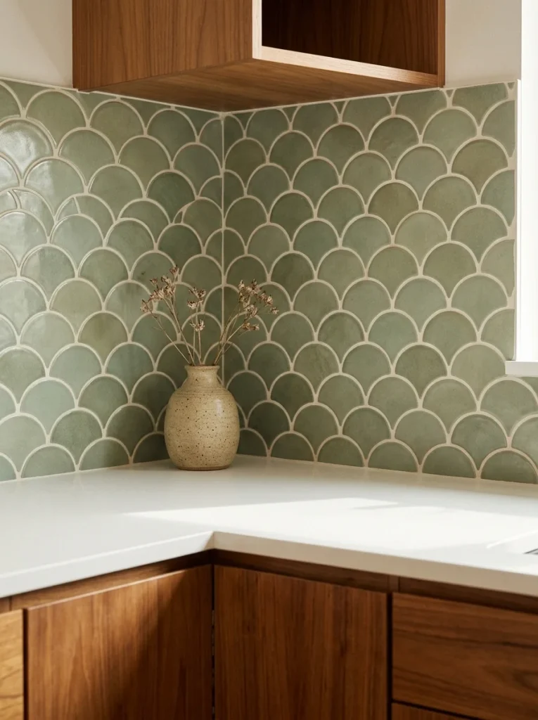
A bold zigzag or scalloped tile backsplash only works if the rest of the kitchen gives it room to breathe.
Watch out: adding a patterned backsplash on top of patterned flooring and colorful cabinets usually tips a kitchen from lively into overwhelming.
Pick one loud element, let the backsplash be it, and keep cabinets, kitchen counters, and floor in calm solid tones around it.
WATCH OUT
One bold pattern reads as intentional. Stacking several competes for attention instead.
22. Cane Back Barstools Soften a Peninsula Lined in Hard Materials
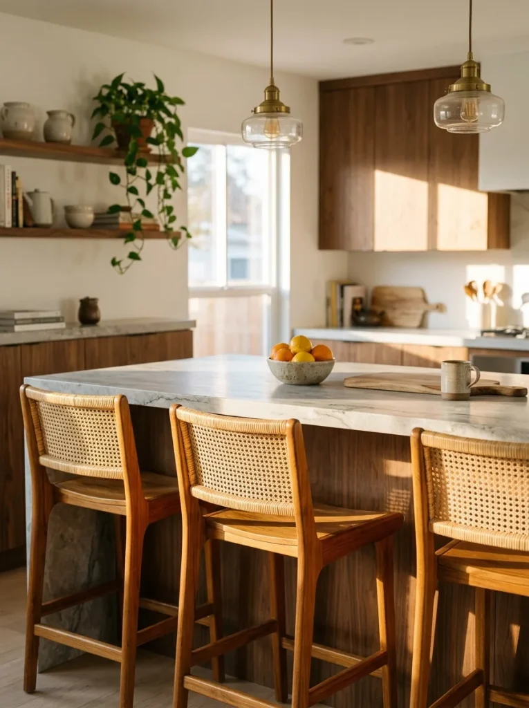
Pull cane or wicker back stools up to a stone or laminate peninsula and the woven texture immediately warms up an otherwise hard-edged run of materials.
- Choose a cane back with a wood frame rather than metal for the warmest effect
- Mix in a woven seat cushion if the cane back alone feels too firm
- Space stools with a little extra room since woven backs read bulkier than slim metal ones
Conclusion:
Twenty-two ideas is a lot to take in at once, so don’t feel like you need to chase all of them.
Most of these kitchens built their look around just two or three strong choices, a cabinet color, a counter edge, one standout fixture, and let everything else stay simple.
That’s really the whole formula behind mid century modern style.
Pick the pieces that fit your own space and your budget, and save this board so you’ve got the full list to come back to when you’re ready for the next project.